JayisGames.com is now available ad-free!
Jay is Games recommends Cheat Happens with 8,000+ games and 35,000+ trainers!

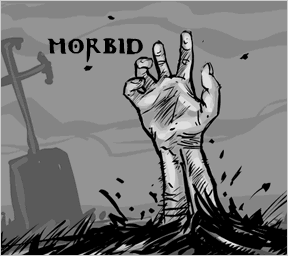
Morbid


  • Currently 3.8/5
  • 1
  • 2
  • 3
  • 4
  • 5
Rating: 3.8/5 (262 votes)
Comments (111) | Views (30,180)

JayMorbidPastel Games has just released a new point-and-click game, Morbid, designed and illustrated by Maciej Palka with programming, animation and puzzle support from Mateusz Skutnik.

While everyone here at JIG agrees that the artwork contained within is well-conceived and the atmosphere is enticingly moody, we weren't as impressed with the gameplay. Hard-to-find hotspots turn this game into a disappointing exercise in frustration. The art just seems to get in the way of an entertaining experience, and it makes the game more difficult to play. Sometimes you can't differentiate between stylistic scribbles and objects you really need to pay attention to.

Sacrificing the interface for the sake of art was a poor design choice. The lack of direction also feels a little sloppy, since unlike Scene of the Crime, in which you have a reason to be searching around, this one just sort of plonks you into the countryside where you might not have any reason to think of peeping inside a tree trunk or picking up a random pot. A bit more story direction would have helped things along, instead of leaving us to stumble about clicking on seemingly random places.

Play both games in the Morbid series:

But decide for yourself (and please let us know what you think in the comments). We were on the fence about whether to feature this one, so I decided instead to compromise with a blurb that expressed the reasons for our disappointment. My hope is that it sparks some worthwhile discussion about it for this talented group of game designers.

Play Morbid

Walkthrough Guide


(Please allow page to fully load for spoiler tags to be functional.)

Complete Morbid Walkthrough

  1. Go down the road. After getting most of these next ones, you need to back up a few steps to go to the next place.

  2. Left tree, hole in tree, get parchment.

  3. Middle fence, get pot on fence.

  4. Graveyard, left tombstone, get holy water.

  5. Woodshed, get hammer. Click on middle log, and get wooden stake in upper right corner of screen.

  6. Go back to road, follow road to water wheel.

  7. Follow wheel piping to swamp, get ladder.

  8. Back to house, use ladder on front door (not while looking at door, but back a step).

  9. Up ladder. Up again to roof of house. Yikes! What's that in the back yard?

  10. Look in the chimney. Get carbon black.

  11. Back up to bars, use hammer to open them.

  12. Enter cellar. Put pot into keg of salt water.

  13. Back up to the fire. Put pot on hook, grab torch from fire, grab salt from pot.

  14. Back up from fire, click bottom left corner to see inside front door. Get lever. Open door. Go outside.

  15. Fence on right side of house leads to crypt.

  16. Use torch inside crypt, find garlic on left.

  17. Back up to road, go to water wheel again. Use lever to move the wheel.

  18. Back up one, left side of wheel now leads to path. Follow it.

  19. Up the stairs. Ignore the skull. Find the door.

  20. Put garlic on door. Put carbon black on door. Open door.

  21. Before approaching grave, lay down salt.

  22. Put holy water on stake.

  23. Put stake on corpse.

  24. Hammer it in.

111 Comments

notazombie June 8, 2009 4:21 PM

Is there no way to increase the size of the viewable play area?

Reply
Robynthegeek June 8, 2009 4:44 PM

All I can find is a

Hammer

and I can't seem to find any locations besides the

red eyes, forest, front of the house, back of the house and mill


What am I missing, anyone?

Reply
Robynthegeek June 8, 2009 4:48 PM

Now I've got:

holy water, a pot, a scroll and hammer. I found the graveyard to the left of the house, and the hole in the tree to the left of the house am I missing some key piece to make sense of all this?

Reply

Robyn -

there is a swamp area to the right of the house, past the "water wheel" where you will find something useful

Reply
Ramoneur June 8, 2009 4:53 PM

There is a water mill and a bond on the right, where you can find a ladder to get to the top window of the house

Reply

you can pour the holy water on the stake. theres also a ladder in a swamp, but i dont know how i got there..

Reply
Ramoneur June 8, 2009 4:55 PM

Now I've got

holy water, pot, parchment, hammer, small torch, garlic

Reply

I have hammer, parchment, small torch, garlic, holy water, and salt (from boiling salt water in pot over fire). any advice on what to do next?

Reply
Robynthegeek June 8, 2009 4:57 PM

Thanks! Once I found the

ladder

Things flowed better.

Reply

This is more frustrating than difficult.

Am I missing something to use the ladder to get into the window? I have hammer, stake, parchment, ladder.

Reply
Veronica June 8, 2009 5:02 PM

What's up with the scrolls? I finished the game with 2.

Reply

can anybody tell me where the


stake

is?

Reply

where do you find the

stake?

as for using the

ladder, you must be in the view where you are closest to the door in order to place it

Reply
Veronica June 8, 2009 5:05 PM

and the

spider

?

Reply

Chris and Prana:

The stake is in the same screen as the hammer but when zooming in on the log in the middle, you'll see the stake lying in the doorway on the upper right.

Reply
Ramoneur June 8, 2009 5:07 PM

stake is on the right of the wood pile

Reply
Ramoneur June 8, 2009 5:09 PM

how do you get water in pot ?

Reply

Prana:

I'm looking straight at the window with the bars and have clicked that ladder all over the place. Is there another screen or something?

Reply
Cassandra June 8, 2009 5:12 PM

fuzzboxer:

zoom out one more screen, so you're looking at the door, not the window

Reply

For those having problems with the ladder:

Place the ladder on the screen where you can see the door, bottom floor window, fence, tree, etc.

Reply
Robynthegeek June 8, 2009 5:12 PM

To get h2O:

go into cellar (seen just under the edge of the table) and use the pot to scoop up some salty water.

Reply
Cassandra June 8, 2009 5:13 PM

im having trouble with the water in the pot. i have the water flowing, but i can't seem to find the place to click with the pot...

Reply

fuzzboxer -

you need to be in the view that shows only the door in front of you, then click to ladder to place it. then you can climb up and look at the window

Reply
Cassandra June 8, 2009 5:14 PM

oh! thanks!

Reply

Just found the

lever for the water mill in the house leaning against the door that is locked from the outside

Reply
MrHangman June 8, 2009 5:19 PM

Completed it.

You have to get on the roof of the house. It's frustating when you don't have clear markings from where you can go to another location.

Reply
Anonymous June 8, 2009 5:19 PM

Where is the

pot?

Reply
Anonymous June 8, 2009 5:19 PM

Where do you get the garlic?

Reply
Cassandra June 8, 2009 5:24 PM

Guest:

when zoomed out looking at the house (the view where you can see the tree on the left) click the fence in the middle, it should be easy to spot

Reply

Cassandra:

if that's where the pot is, then I'm blind.

Reply
maggie Marion June 8, 2009 5:31 PM

Long time player - first time poster. hoping for some help with finding the water! I can't find the cellar!

Reply
Cassandra June 8, 2009 5:34 PM

fuzzboxer, try zooming in one more time, then try

Reply

Okay, specifics matter in this game. That's what is so mind-numbing about it.

Here's how to get the pot:

On the screen that shows the tree next to the house, click on the fence to the right of the tree NOT where the tree is.

Reply

I used the

lever with the water mill to flood the area

then I

found the cave

then I

used the black stuff from the roof (in the chimney) and the garlic to open the door

now I am stuck

looking at the vampire with my salt, hammer, stake, and two scrolls

Reply
Cassandra June 8, 2009 5:37 PM

oh! sorry, i meant the fence halfway between the tree and the house, i can see where my wording was a bit ambiguous...

Reply
Miketron June 8, 2009 5:40 PM

Okay, here I am.

Went to the right, looked in the tree for the Parchment.

Got the Bowl on the fence.

Into the cemetery for the Holy Water.

Behind the house for the Hammer. You can get a Stake, but only if you are zoomed in on the chopping block beside the Hammer.

Went across from the house, behind the water wheel for the Ladder.

Back to the house, used the ladder above the door, beat the bars open with the hammer, and crawled inside.

Pulled the Torch from the fire, and the Lever from the door, and found the basement trapdoor.

Filled the bowl with the Salty Water in the basement.

went back up, put the bowl on the fire, got the Salt after it boiled down.

Used the torch in the cellar outside to get some Garlic.

Used the lever on the water wheel.

Went across the new path to the cave. Put the garlic on the door inside the cave, and put the holy water on the stake. I don't know why you would want to do that sort of thing, though.

I feel like these spots are important, but can't figure anything out:

Where all the beady read eyes are?
The chopping block?
Something else in the basement?
In the cemetery?
The skull in the cave?
The big tree in the field?

Reply

Done. I have

"destroyed the beast".

Enjoy the game :)

Reply
Cassandra June 8, 2009 5:44 PM

yay! done!

Reply

No problem, Cassandra. Most of this game seems dependent on blind luck/perfect clicks. At least, that's the way I see it.

Very uncharacteristic of Pastel Games, like Jay mentioned in his review.

Reply
karooth June 8, 2009 5:45 PM

I am staring at a Vampire and lost as to what I am supposed to do.

Reply

where's the garlic?

Reply
Cassandra June 8, 2009 5:48 PM

it made me sad, because usually, anything from Pastel Games or Mateusz Skutnik is officially awesome. not this time unfortunately. one of the most frustrating things for me was the fact that there were two screens where there was absolutely nothing! a game as nit-picky as this one doesn't need red herrings thrown in too.

Reply

Ok, here what I've got so far, may help some, i'll pop it all in one spoiler

Move toward the house, click left and up to get the scroll,

click back, straight ahead and get the pot

click forward, into the grave site, click far left grave and get the holy water

click back twice, click the back of the house, pick up the hammer, click on the chopping block and get the stake from the upper right

Use holy water on the stake

click to main road, click on the right hand side, right hand side again to get the ladder from the swamp

go back to house, mount ladder in front
Go up, use hammer on bars

click upward onto the roof and then the chimney, get the black carbon

click back, click inside house and then by the table

go down, use pot on barrel, go back up and use this in the fire, get salt

get the torch from the fire, go back out front, while taking the lever from infront of the door and then click on gate

go inside the cellar, use the torch to get the garlic

go back to the water wheel and use lever, then click upper left and go across the swamp

thats as far as i've got, other than the dead end across the swamp, looks like you have to kill a vampire though

Hope that all helps some, appologise for the haste of which it was written

Reply

Complete Morbid Walkthrough

  1. Go down the road. After getting most of these next ones, you need to back up a few steps to go to the next place.

  2. Left tree, hole in tree, get parchment.

  3. Middle fence, get pot on fence.

  4. Graveyard, left tombstone, get holy water.

  5. Woodshed, get hammer. Click on middle log, and get wooden stake in upper right corner of screen.

  6. Go back to road, follow road to water wheel.

  7. Follow wheel piping to swamp, get ladder.

  8. Back to house, use ladder on front door (not while looking at door, but back a step).

  9. Up ladder. Up again to roof of house. Yikes! What's that in the back yard?

  10. Look in the chimney. Get carbon black.

  11. Back up to bars, use hammer to open them.

  12. Enter cellar. Put pot into keg of salt water.

  13. Back up to the fire. Put pot on hook, grab torch from fire, grab salt from pot.

  14. Back up from fire, click bottom left corner to see inside front door. Get lever. Open door. Go outside.

  15. Fence on right side of house leads to crypt.

  16. Use torch inside crypt, find garlic on left.

  17. Back up to road, go to water wheel again. Use lever to move the wheel.

  18. Back up one, left side of wheel now leads to path. Follow it.

  19. Up the stairs. Ignore the skull. Find the door.

  20. Put garlic on door. Put carbon black on door. Open door.

  21. Before approaching grave, lay down salt.

  22. Put holy water on stake.

  23. Put stake on corpse.

  24. Hammer it in.

Reply

Karooth -

you need to light the candle with the torch

and then

(while in view of the side of the casket, i.e. not seeing the vampire at all) put salt around

now you should be able to finish it.

Reply
karooth June 8, 2009 6:04 PM

Help Please!

Stuck with the beast and I can't use the stake. What do I do now?

Reply

I have the:

Holy Water Soaked Stake
Scroll
Salt
Torch
Hammer
And I put the garlic on the door.

Am I missing something? Because I feel like I should be...

Stabbing a bloodsucking fiend in the heart right now.

Reply
seaflower June 8, 2009 6:09 PM

Aaaw..

touching end..;)

I loved playing the game.

Reply
Anonymous June 8, 2009 6:13 PM

salt around the coffin?

never heard that before!!
Agree with previous posts, submachine was pretty awesome.

Reply

Eddie -

You need to:

Go back up the ladder, and instead of going into the window go further up the roof. Click on the chimney to get the carbon black.

Then you can:

Go back to the cave and put the carbon black on the door.

Reply
DylPickle June 8, 2009 6:23 PM

I was kinda disappointed with this one. Not a very good story, IMO.

Reply
seaflower June 8, 2009 6:31 PM

Btw, the introduction was good enough for me... I love

vampire stories, so the searching seemed rather logical to me. I just didn't understand the meaning of the 2nd parchment

Still, I had no trouble finishing the game and I loved the atmosphere. I don't think the hotspots where really that hard to find and I didn't need the walkthrough. Thanks Maciej and Mateusz!

Reply

seaflower:

What 2nd parchment? I never found one of those. The first parchment tells you to put the salt around the coffin.

Reply
seaflower June 8, 2009 6:53 PM

Otto:

2nd parchment is on the bottom shelf in the vampire's room. It's a map of Paris, but I have no clue what to do with it. I finished the game without using it

Reply

i can't find the ladder. anyone?

Reply

Paul -

The ladder:

Go towards the watermill. To the right of the watermill is a swamp. The ladder is in the swamp.

Reply
Snagging June 8, 2009 9:11 PM

This was a great game given you have played pastel games in the past you should know you have to search a lot for things and try odd things and places this game not for someone who dosent play point and click but if you do its a wonderful game

Reply
KateBiggs June 8, 2009 9:13 PM

The play reminded me of the 12 gnomes series with the scenes where you scroll back and forth and others where you zoom into particular scenes that you can't interact with. With that in mind, I didn't find the gameplay all that tough. I actually enjoyed it quite a bit.

Reply

Most of the comments so far seem to focus on hints and clues, so I'll just give my thoughts on the game in general.

In brief, I have to agree with the review above. The artwork is beautiful, but there is no rhyme or reason to the game. The player has no goal, just a vague idea that we are dealing with undead. Depending on the type of undead, though, the measures we need to take are different. When I saw the hand sticking up out of the ground, my first thought was zombies, which are handled in an entirely different manner than the undead we are actually faced with.

After blundering around a few screens with absolutely no idea what I was supposed to do, I gave up and decided to go through the walkthrough. With that as my guide, it was fairly simple, but none of it seemed intuitive to me at all. How could I have known all of that in advance?

And I wonder what would have happened had I encountered the vampire without all of the safeguards I picked up along the way. I wonder if I would have died or if I would have been given the opportunity to go back and get all of those objects. How I would have known I was supposed to hang garlic on the door and draw a cross inside that with carbon black from the chimney, and then sprinkle salt around the coffin, is beyond me. Like I said above, following the walkthrough it makes sense, but I don't think there is any way I could have figured all this out by myself, despite my familiarity with vampire folklore.

I found the interface a bit confusing as well in terms of moving around. Some of the screens scrolled for no apparent reason. Also, if I click right to go to a certain screen, I expect to click left to return to the previous screen, not down. It made it very difficult for me to form a comprehensive picture of the geography of the game, and all the screens ended up feeling like completely separate scenes linked together artificially.

The only thing I can say in the game's favor (aside from my comments on the artwork) is that there was no pixel hunting. As mentioned in the review, though, it's not really clear what is clickable and what isn't, so I suppose it amounts to the same thing.

While I appreciate the work that obviously went into this game, it could definitely have been a lot better.

Reply

I don't understand why you see this as poorer-quality than any of the other point and click games that Pastel Games has produced recently.

The interface is exactly the same as the one used in the house escape series, and the puzzles in Morbid are actually more logical.

Drawing crosses, sprinkling salt, and collecting garlic for what, after finding your first couple objects, is obviously going to be the ultimate goal of killing a vampire makes much more sense than, for example, fixing a gramaphone to distract three bats that you must command to do trivial tasks any human could easily complete by themselves.

Also, be honest...In this genre, do you really need to be explicitly told to go searching around, hunting for tiny hotspots, and trying to combine everything with everything? From the opening sequence, we know there are undead lurking somewhere. Isn't that more than enough motivation, or at least as enough as the classic locked door?

In regards to pixel hunting and confusing, clunky navigation on a dull gray background, wasn't that each and every installment Ten Gnomes?

Are these all horrible games? Of course not. They have their flaws, but they're still entertaining and visually interesting. I don't understand why you guys didn't like this one while giving more or less glowing reviews of the others.

Reply
Sylocat June 8, 2009 10:58 PM

Must... resist... urge... to... chant... "I want Submachine 6!"

But in all seriousness, I agree with Spork insofar as the frustration element is par for the course in this genre (remember the string by the well in Daymare Town? How was anyone supposed to find that without a walkthrough?). I thought the horror elements in this one were actually fairly effective, if a bit overdone.

Reply

Good on ya, Spork! That's exactly how I feel about this game - no more nor less random than any of the other Pastel Games, no more nor less annoyingly picky than any other point-n-click, and the story made perfect sense once you know you're dealing with the undead. I'm not disappointed with the game, I'm disappointed with the review...

Reply
Zabigdog June 8, 2009 11:01 PM

I liked it fine though I wouldn't have made it without hints/walkthrough. Pastel Games are the ones I usually can do on my own. They're almost sort of logical, to me.

I liked the game and thought I was being fussy about the seasick-making scrolly screens (that's why I can never play 10 Gnomes) and the somewhat random shots I landed on sometimes. I love the hotspot cursor change and always feel guilty about that. It was hard remembering how to get back to certain places and I spent more time revisiting empty spots than solving problems.

But it was fun-creepy and I got most of the same satisfying hit as with their other games. I dislike the goofy cartoon quality and palette of the art in the Great Escape series (though I like this more subdued drawing style, like in Fogfall and this one), but I like the gameplay so much I deal with it.

Overall I wasn't particularly let down; I was surprised to see JIG's so-so review. How could you not feature a Pastel Games game?? They've got a long way to go before I don't want to know the minute a new game comes out.

Reply

I'm glad that at the end you guys decided to feature Morbid here. Even though you really hammered the game in the review, Jay (sorry for the pun :P), I found it not as bad as I expected.

I agree that the storyline could have been more fleshed out...

...perhaps putting the player in the role of a local priest who decides to investigate mysterious disappearances in the village...

... but there have been similar games with no background story reviewed here, but the lack of context has not been so emphasized as a bad thing before.

I also agree that at times the hotspots were a wee bit too close to each other, making it difficult to discern unvisited places.

This made finding the lever difficult, because the hotspot leading to that scene was like, ten pixels away from a more obvious clickable place, and on the bottom of the screen - the position that this game reserved for backtracking.

However, I don't think that the art was getting in the way of finding critical objects at all. I had no difficulty picking out the important stuff from the scenery.

Speaking of which, the scenery deserves special mention. The artist did such an awesome job portraying Central European countryside, that it brought back childhood memories of mine. The places, objects, sounds and overall composition carried such an intense "real" feel, the story could have taken place in the same village I've spent many childhood years at (sans the creature, of course).

Another strong point that I feel could have been emphasized is that the Polish creators chose not to go with the overused stereotype generally associated with this creature.

The methods, the looks of the vampire and the way the story ends are different than one would expect, if one's exposure to vampire lore consists only of Dracula-clones and Underworld.

Overall, Morbid is now one of my favorite point-and-click games, and certainly the one with the most-lasting impression.

Reply

Once again, the hardest part of a game by Pastel Games is not actual puzzles but deciphering where to go in a world made entirely out of scribble.

Reply
Anonymous June 9, 2009 4:06 AM

The hotspots were 10Gnomes-style insane sometimes, it's true. The question is, is it worth it for the art? Maybe it could've done with little indicators when you mouse over clickable spots.

By the way, the art on the "Authors" screen suggests the protagonist is some sort of super-badass undead hunter.

Reply

I suppose I should add that point-and-clicks aren't generally my cup of tea anyway, so that probably colored my own review above. It's interesting to see that a number of people enjoyed this.

Still, though, I would have liked to been presented with the main puzzle first and then gone about trying to solve it, rather than just randomly click on everything within reach and then attempt to combine them with everything else. Perhaps that's more an assessment of the genre in general than of this particular game.

Reply

Could someone please explain to me where to put the

bowl of salty water

before

approaching the vampire

I've tried clicking everywhere, it's driving me mad!

Reply
The Great Dane June 9, 2009 5:35 AM

Another fantastic game from Pastel Games.
The level of difficulty is harder than the escape the house-series - and thank you for that!

I did it on my own. How could I do this? Persistence and patience. That's two of the main skills that you need to play these kind of games. But it comes easy when you're enjoying the genre, and the beautiful artwork. I think the drive is the player's curiosity and the "brainreward" each time you discover something new.

I admit that there's frustration. But that's always a part of this genre. It can become tedious in some games - like pixelhunting. But in this game for me it made sense when I got stuck and started thinking:

I needed a stake - so I thought: "where could it be". And then I narrowed my search and found it. And towards the end I was stuck and I looked at the house from away and thought: "I wonder if I could get to that chimney", and then I found the way.

So I found it logical even though it was frustrating in between.

I always loved the adventuregame/point'n'click genre, specifically because of the storyline. It develops faster than any other gametype - something new happens. Other games you can "learn" to do something, and then often become trivial to me. This genre always gives you surprises and something new.

So maybe let someone who enjoys the genre do a review of it next time. :)

Ps. Is there something wrong with the character-code? After I press preview and then try to submit, it won't accept my code.

Reply
The Great Dane June 9, 2009 5:51 AM

Eliza:

You only need the salt from the water. How do you extract salt from water?

Reply

Eliza -

You put the:

Salt water onto the fire in the house. It will boil down leaving just salt. Take the salt.

Reply

Why has he been given a large lunchbox?

Reply

Well this isn't really all that hard, compared to some similar games that have been reviewed here.

I only needed the walkthrough once, because

I couldn't work out that the holy water had to be combined with the stake.

Overall I really liked the atmosphere and found the solutions to the puzzles quite satisfying. As has already been mentioned, a slightly deeper story would have been appreciated. And a few more scary moments would add to the atmosphere ;)

Anyway, an enjoyable 20 minutes, and I much preferred this to the Great Escape series.

Reply

Completely agreeing with the review.

Morbid breaks many of the genre-cliches, but the end result is not good.. mostly because those cliches are there for a reason.

For instance, you are usually confined in a room because it makes navigating rather easy for the player - four walls and that's it. Open countryside with no visible boundaries doesn't give off a feeling of freedom - instead it makes the player frustrated because he never knows what area represents a "wall" and which one a "passage".

Hot spots with no rhyme or reason are simply attrocious. You can't click on an open door but you can click on a part of a fence. You can zoom in on the rive but you cannot click anything on the river screen. In the end you are resorted to pixel hunting which is made even more frustrating with the "scrolling" levels.

Too bad. I love Mateus's games and I cannot believe he has put his signature on something like this. Thumbs down.

Reply

"I am pleased to see some discussion, finally, about the game and not just cries out for help with where things are located."

Jay, it just took us that long to get through the game! I think that's a review in and of itself, especially considering Pastel's past games (which I've never had a problem with).

The Achilles heel of Morbid is that there is no clear flow between each screen leaving to a lot of random clicking. At least with Pastel's past games you were confined to a certain room or space and had some idea of where a logical hot spot was going to be.

Sometimes the difference between two screens is mere pixels and that IS pixel hunting, though not in the traditional item search way.

Obviously, everyone has their different ideas on what makes a good point and click game, but I think the comments show a majority towards negative rather than positive for this game. I only hope Pastel Games reads what we've said and learns from their mistakes because, up until this point, they've had a great track record.

Reply

No, I can't give this a pass, as eagerly as I click on Pastel Games every day. The narration is completely sloppy, relies on cultural knowledge that's not universal (unless you're saying we all watch Supernatural), and I just saw the same type of art used correctly in The Fog Fall 2.

I disagree that this is just as illogical as Daymare Town. Surreal is not necessarily illogical. Daymare Town was designed and directed with b/w line drawings to play with the perception of b/w line drawings describing a point-and-click space. That does not mean it lacked internal narrative structure or logic. A player engaged their creativity and pattern-recognition, and weren't wrestling with the interface. Same with the House series, which was barely held together by the Rube Goldberg type combinations.

There's a word for this, and it's "brute force." With all due respect, if you're getting through the Pastel Games repertoire by pointing and clicking randomly, there are a million other games of varying quality where you can do exactly the same thing. When I know where I want to look, but I spend the majority of my time trying to find the hotspot, that's a definite lack of direction.

IMO they would do very well to run it through testers who can and will tell them no, this will not work. It's not the first weird misstep Pastel Games has made in recent months, and I sincerely hope it doesn't become a trend.

Reply
Susan Winter June 9, 2009 12:24 PM

omg, even with the walk through I could never find that darn stake. More frustrating than fun which is too bad, since a lot of work was obviously put into the game. Big thumbs down for me!

Reply
seaflower June 9, 2009 2:36 PM

fuzzboxer:
quote: 'Obviously, everyone has their different ideas on what makes a good point and click game, but I think the comments show a majority towards negative rather than positive for this game.'

So far 12 positive against 8 negative 'reviews'... :)

Like mentioned in comments above I found it very Mateusz Skutnik: there are elements of 10 gnomes, the great escape series, Daymare town, Fog Fall etc. and that's why I found this game not all that difficult. I thoroughly enjoyed the game. Especially because it was not confined to a certain room. I loved playing in the open.That made it more of an adventure to me.
Have to agree with you, though, that everyone has different ideas about a good point and click game :)

And I still would like to know what

the 2nd parchment was about!

LOL

Excuse my English... it's not my native language. I'm European :)

Reply
Anonymous June 9, 2009 3:47 PM

I did not like it. It was definitely far more frustrating than enjoyable. It looked really nice but the navigation was terrible. Hopefully the next Pastel game will be better.

Reply

I'm not as much of a fan of the 'House' series as, say, Submachine, but on the whole Skutnik and team produce some of the best games in the genre.

This is not one of them. I agree with other people about the irritating navigation, which works very well in the context of something like 10 Gnomes, but not so well in a point and click escape the room type game. It annoys me no end when a game set in a four walled room can't get navigation right - in an open, countryside type space it's an absolute necessity.

There's a difference between conventions that exist because of tradition, and conventions that exist because they work. Navigating needs to be intuitive because frankly, navigation is not part of the puzzle. If a game is hard or frustrating, it should be because it's cleverer/better than the player; not because the player has to struggle to use the interface! That's true whether the game is a homemade interactive fiction project or a multi-million pound big studio production.

One of the things that made the House series enjoyable, and the Submachine series spectacular, was working out the mechanisms that governed the environment - you're provided with all the information you need to come to the solution, even if it takes a while. In Morbid, I was able to finish it without a walkthrough or trial and error only because I had a lecture on European superstition a few weeks ago, otherwise I wouldn't have guessed about

putting salt around the coffin.

Requiring cultural knowledge to solve puzzles is not the worst crime a game can commit, but it can be rather frustrating. It removes the element of thinking like the game and turns it into a knowledge contest.

The sparseness of the storyline didn't bother me all that much. I worked out that I was looking for

a vampire as soon as I found the first parchment

and while I like a good yarn, if the gameplay is good, I can live without it.

There were elements about this game I liked. The artwork was pretty good, and the atmosphere suitably creepy. The result when

you stake the vampire is nicely understated and it's nice to see a different kind of vampire myth being used than the norm.

But, overall, this game is too flawed to be really enjoyable, and not memorable enough to make up for it's flaws.

Reply
Zabigdog June 9, 2009 4:20 PM

Okay, follow up comments. First, I played both Daymare Town games through, just to compare. And to fill in the hopelessly empty hours of this particular day, I confess.

I've played both versions before and still had to use the walkthroughs to get them done in a reasonable time. The art is at least as coy when it comes to knowing what to click, and the logic is sometimes spurious. Yet I love them and consider them second only to what I'll probably always long for as my first point and click love, the Submachine series.

Then I came back and played Morbid through once again. I truly don't get what people are griping about. The art is lush (everybody gives it marks for that), the sound is juicy, and playing it through with all these crits in mind, I'm actually amazed that so many people biyatched about the scrolling screens like in 10 Gnomes. I could imagine Mateusz thinking, hey, everybody's so wild about that game, I'll include some here! They'll love me!

My absolute only gripes are weeny and I'm such a newb at these games that I can't figure out why experienced players are sore: it's freaking HARD to find the path through the water, even knowing it was there somewhare, dagnabbit, and with friendly helping-hand-hotspot-cursors (because there's about eleven hotspots on that screen) and I wouldn't have known for yonks that salt should go around the casket. But after seeing experienced point and click afficionados whip through combinations that don't even exist in my reality, and succeed, it just doesn't feature that folks are so put out by having to do a little combinatifying....

Jay is right, it's fun to see/participate in an animated discussion about the design. Mateusz = hubba hubba in my book still.

Reply

I tried to play this game..but it just left me frustrated. The art was cool for a short time..then just became irritating.

Reply
Maria B June 9, 2009 7:54 PM

I found this game a bit harder to navigate than the House Escape series, due to the lack of colours, but still more logical in its puzzles. The story was nice, too, and I for one did like having to figure out my purpose as well.

And for the people wondering about the salt:

it says in the first scroll when you hover over the writing in the corner: "black heart will perish staked through in circle of salt"

Reply

Wow... that's a whole lot of comments. Well, I confess, I haven't read them all, and I still want to put my two cents in, so, to avoid too much repeating, I'll try to keep this short.

Generally, I agree with everything that Suho said, so take that as my critique (Thanks for typing that up for me, Suho).

RE Sporks comment:
The difference between this game and the house escape series is that, first, the house escape series doesn't attempt to offer a logical setup for your entrapment from the beginning. It seems instead to be intentionally absurd.
Morbid starts out with a rather misleading storyline. That the black plague creates undead, ok, that it creates vampires... huh? But of course we don't know that they are vampires until we actually find one (though there is one clue early on). In fact, I wasn't even sure if I was playing a living or undead character until I found the vampire. The last thing you see in the intro is the hand coming out of the ground, and then there you are on an empty road in the woods. I too was thinking zombies.
But red herrings aside, the only way to know what to do with most of the things you found was simply to try combining everything in your inventory with everything else in the game. That's a lot of possible combinations. If that were enough to keep me interested, I'd just spend my time trying to open padlocks by randomly spinning the dial.
The house escape series begins with absurdity, continues in the same vein, and eventually offers some kind of plot towards the end. Morbid, unfortunately, begins and ends with a logical story line but leaves the player without enough information to put it all together. Perhaps it ought to be retitled Sub(par) Machine.

Many thanks to Jay and the crew for bringing us a game I can confidently give a vote of 1 mushroom. I was getting really tired of liking everything.

Reply
Anzhela June 9, 2009 8:40 PM

I'm surprised to see a review like this from Jayisgames, because I actually enjoyed this game and didn't find it too frustrating at all. Other point-and-click games have had me ready to pull a few hairs out of my head in the past, and this one didn't so much as make my scalp tingle with irritation. Of course I did have to click, click, click, but that's nothing new for these kinds of games. When I did have a bit of trouble, spending an extra few seconds taking a look at the surrounding items to find something wasn't that much of a hassle. Once I found what I needed to find, it wasn't difficult to figure out what my next step needed to be. I don't have many gripes about this game and I'm glad to have seen it featured.

Reply

Those complaining about cultural knowledge requirements must have simply missed the giveaway clues that were laid out right inside the game. Take for example...

...the salt circle that many brought up as an example. Upon inspection of the first parchment, one can find a rather large hotspot (the writing in the lower right corner). Mouseover the spot, and the following text becomes readable:

"Black heart will perish staked through in circle of salt"

Bottom line: just because a walkthrough doesn't mention every clue, it doesn't mean it's not there. ;)

Also a bit of trivia:

In the dark storage room behind the house, the stuff hanging in the middle looks a lot like the Pastel Games mascot tied upside down. :-)

By the way, anyone figured what the second scroll might refer to?

Reply

Count me on the negative side, though not a hater.

Given the atmospheric and intriguing intro, would it have been so hard to include a letter from the bishop addressed to you detailing supernatural activity in the area and instructing you to deal with it? And equipping you with a book on the occult so you could deal with whatever supernatural entity it turned out to be? It would make gathering stakes, salt, etc. much more reasonable.

I actually liked that the navigation interface was invisible. I hate games with giant green arrows obscuring the game and ruining suspension of disbelief. But one place's relationship to another was very arbitrary. It's like they planned a bigger game, then decided not to draw half the locations. Two scrolling screens for no reason also feels like someone gave up.

With so many things that beg to be clicked on but do nothing, there's no reason to make crucial objects and locations random sections of fence or sticks of wood.

With Pastel's reputation and past work, each game should be better designed and smoother than the previous. They're using coding and conventions from previous games and have loads of experience/mistakes, why can't they take time for clear goals, navigation, and an enjoyable story?

Reply
brokenrecord June 10, 2009 4:08 PM

I would say that the story is about on par with the rest of Pastel's games, but the problem with this one though, is that story and motivation are essential for the horror/suspense genre. If I'm scared, why should I explore more? Why should I go down the dark tunnel and start poking things when there's a nice (three-walled) house I can hide in?

Also, count me among the ones who thought the interface was annoying and hard to navigate. Overall, a good effort, but ultimately falls short of its potential.

Reply
Ranger Jan June 10, 2009 4:35 PM

Afterthoughts - Possible Morbid 2 ??? . . .

The areas that may not have been utilized completely or at all . . .

Beady Eyed Forest, Chopping Block wOverturned pitcher, Celler, Cemetary, Skull up steps in Cave, Big Lone Tree

. . .

These places might be used in a Morbid 2. Hey, folks, we get to play these games for FREE. Stop gripeing. To the Authors, I appreciate the ENORMOUS time you put into programming and thoroughly enjoy your efforts. Some games more than others. Love Submachines and Escape games! Thought this game might even have a possible Morbid 2 where the "Beast" has "infected" others already (beady eyes) or maybe these are a Werewolve family?! Anyway, cudos to you folks and keep them coming. From a new friend in Tucson.
"Ranger Jan"

Reply

I'm totally with Ranger Jan. I always enjoy Pastel Games because they are entertaining. That's what games like this are supposed to be. Did thoroughly enjoy the Submachine series, and Daymare Town. Keep 'em coming!!

Reply

I have to say I'm rather mixed on this, it's a great concept...though it falters in execution.

The Good
-Very nice atmosphere
-The intro was good, loved the rats and the Plauge Doctor.

The Not so good
-Lack of direction (One of the major problems)
While the intro set the backstory (somewhat, the plauge is apparently a red herring) the players don't have a clue what their supposed to be doing or looking for. Normally I don't mind that kind of thing with "Escape the Room" games, when your plopped down outside in the middle of nowhere...it would be nice to have some kind of direction.

-Certain items blending with the background.
For me this was a pain, mainly due to not knowing what I was supposed to look for. If I knew what to look for, it wouldn't be a problem.

-"Dead" Areas
While sections such as the large tree, the forest with red eyes add to the atmosphere...in reality they serve no purpose for the game. They are not a pathway, and there's nothing to obtain in them. It's wasted space they could have had fun with.

Last but not least, the Interface.
This is a blessing and a curse, it' a blessing since it really allows you to enjoy the art...but it's a curse since due to the lack of direction, we are left frantically clicking around trying to find a pathway or object we can interact with. I really admit I wouldn't mind seeing some kind of arrow leading to a pathway, instead of clicking in rather obscure areas to get somewhere.

So while I do enjoy the dark theme and wouldn't mind seeing a sequel...some direction would be very much appreciated.

Reply
Ranger Jan June 12, 2009 8:14 PM

Definitive feedback is appreciated when relevant I always say. BUT,........if I were one of the authors and got some of this feedback that said 1) you need "Direction" and 2) don't know what you're "looking for". Then I would say to these people.......

Where's the challenge then!!

That's the whole point to the game folks. There are clues everywhere about what's going on. Some of these games have intro's that tell you exactly what's going on and what you might want to do or go.

These games are POINT and CLICK. If we knew where to go, there would be no fun in FINDING what we need and figuring out what to do with them.

Again, a big applause to the authors for giving us safe, fun and enjoyable computer challenges!!!

Ranger Jan

Reply
Elmo Rogers June 13, 2009 12:12 AM

A bit aside from gameplay of Morbid proper, but

doesn't parchment 2 look like it might be a map to Daymare Town the Second?

notazombie: the resizing restriction seems to be a feature or bug of the game engine that young Mr Skutnik has written.

Reply
dogfloss June 13, 2009 12:24 AM

I'm a little late in the discussion here, but still want to weigh in on the positive side for this game. Gorgeous art, fun gameplay, reasonable puzzles. I only had to use the walkthrough once, because I didn't figure out how to

get up to the chimney.

Other people have complained about "lack of direction", but it seems similar in that way to Daymare Town, Submachine and other Pastel games. The cursor change over clickable areas is what makes this a non-issue. I wish all escape games had that feature! That way you can glide your mouse around to search, without furiously clicking.

Lack of storyline doesn't bother me at all either. What exactly is the storyline of Submachine? And who really cares? The art is gorgeous and the gameplay is fun!

Almost all Pastel games also have scenes in which nothing can be done. Maybe they're just "red herrings" but I don't see why that's a problem.

I confess I'm not a fan of the seasick scrolling screens, which is why I don't play 10 Gnomes. But there were only two in this game, so I didn't have too much trouble with it.

Overall I give it 4 mushrooms, though I'd give it 4.5 if I were able to give halves.

Reply
MeghanBeth June 13, 2009 2:12 AM

I'm a little late on this but...I agree with a lot of the comments here, though I have to say that I found the atmosphere and premise of the game very interesting, and while some things were hard to find, I enjoyed the game overall. It had that same creepy, what-the-heck-is-going-on feeling of the Daymare Town games.

Reply
allimarie June 16, 2009 12:53 AM

It was a great concept and fun to play, but I never would have finished it without help. Some things were just impossible to find if you didn't know you were meant to be looking for them. 3/5

Reply
Anonymous June 21, 2009 3:09 AM

Seriously; Can the folks playing this pastel game, by this designer, be the same folks who played earlier games, like Daymare and Submachine?! Comments on those games had me thinking I was pretty dumb. Never mind the puzzles! How did anyone have the patience, the endurance? Or maybe some folks just have the kind of free time I'd love to have! Lots of folks here seemed to be... more lost than me this time around. ;-)

I have learned to click, click, click of course. I don't really care for it, depending on how rational it is. But I didn't find this game to confusing. In fact, I thought there were oodles of pointers telling the player what he/she was getting into. Garlic? A stake and hammer? That, after the intro?!

This was a good time passer. I don't stress too much about being stuck. I hate stess. I give it a 'little' effort and then I use a walkthru. For me, It's just the fun of passing the time, checking out the art and gameplay and seeing what the author has to show us. I don't like hard puzzles. That 'kills' the fun. I just like disappearing into other worlds.

Arby

Reply
Jen Reid July 6, 2009 4:47 PM

I loved the way it was drawn, and the ominous music. Like the synopsis said, the hotspots and how to properly place objects were a bit sketchy. Although the game looked really cool, the gameplay wasn't that great! I had to refer to the spoiler for pretty much every step or I never would have finished it. Keep in mind though, I'm not a huge gamer lol. Someone with alot more patience and experience that I have could have finished this a lot easier than I did. All in all, I appreciate the time put into it. I'm usually more about how the game looks anyway, unless of course the gameplay is utter crap lol. This however, was not. I give it....2.5 out of 5 morbidly chewed off thumbs up :D

Reply

I don't care what they said on the comments. I still like it. I'm also a fan of Mateusz. Best game maker ever! I can't wait for his next game. I love games like this like Daymare, one of my favorite.

Reply

I liked this one a lot, I don't think the artwork was confusing.

Reply

i can't find the carbon black to open the door plz help

Reply
questioner July 16, 2009 8:40 PM

This may sound stupid, but is this game scary as in drop-the-computer-and-run-screaming-for-the-hills scary? Is it just because of the images, or do things randomly pop out and go oogabooga at you?

Reply
Anonymous July 19, 2009 8:38 PM

where is the torch?

Reply
charmaine July 26, 2009 6:20 AM

i have no problem with looking in random places. exploration is part of many adventure games. having items 'blend' into the background adds to the challenge. in the real world, you don't get arrows pointing at items you should take.

in fact, finding these items is easier than the synopsis sounds because here, the arrow DOES turn into a hand whenever there's sth to click, unlike many games where you have to click pixel by pixel. THOSE really make me angry.

i managed to find everything without a walkthrough, although i had no idea how to use the carbon black and garlic...

but it's a little too short, and the purpose of the game was somewhat disappointing. kill one guy and that's it? creepiness of atmosphere can also be improved

Reply
apstorm July 30, 2009 2:17 PM

Somebody pointed out that the first parchment mentions the value of the salt... and I honestly can say I had no idea there was a hotspot on that parchment that translated the text on it and says: "Black Heart will perish staked through in circle of salt."

I must agree that the navigation and interface was rather confounding... but had I been more observant, I may have gotten some of the things that made me resort to the walkthrough, such as the cellar and the reason for the salt in the first place, or the chimney. I found most everything else with not much trouble, though admittedly it did involve some fairly quick passes looking for the hand cursor, and some hotspots were so close... really should have been better...

Not all bad, but still, could use improvement.

Reply
siriusxdremus September 19, 2009 1:01 PM

I think the link to the link no longer works. When I click on it, the window comes up and said that URL/morbid.html was not found... Is this just me?

[Edit: Thanks for the note. I fixed the links. PastelGames changed their site around without creating any redirects for the old links still out there. -Jay]

Reply
Anonymous October 11, 2009 4:57 PM

Where is the stake?

Reply
Epicnessity October 3, 2010 1:59 PM

ok, so I

got the 1st ending ( killing the vampire) but i think there might be another ending. I dont think pg would put in the red eyes for absolutely no reason. Any ideas?

Reply
SliceOfMilk October 16, 2010 5:32 PM

How do i get the garlic and salt? please help....

Reply

where is the ''keg of salt water'' in the place where the fire is?

Reply

^ Scroll Up | Homepage >

Leave a comment [top of page]

Please consider creating a Casual Gameplay account if you're a regular visitor here, as it will allow us to create an even better experience for you. Sign-up here!
  • PLEASE UNDERSTAND SITE POLICIES BEFORE POSTING COMMENTS
  • You may use limited HTML tags for style:
    (a href, b, br/, strong, em, ul, ol, li, code, spoiler)
    HTML tags begin with a less-than sign: < and end with a greater-than sign: >. Always. No exceptions.
  • To post spoilers, please use spoiler tags: <spoiler> example </spoiler>
    If you need help understanding spoiler tags, read the spoiler help.
  • Please Preview your comment before posting, especially when using spoilers!
  • No link dropping, no domains as names; do not spam, and do not advertise! (rel="nofollow" in use)
chrpa Jayisgames needs your help to continue providing quality content. Click for details Welcome to the Roundup 66 - Retro with four games! After you find the ten monkeys in the chapter, look in the inventory. You will find a...  ...
chrpa Jayisgames needs your help to continue providing quality content. Click for details Welcome to the Roundup 65 with three games! As mentioned in the previous roundups, only odd-numbered episodes are featured since even-numbered are for Robin Vencel's patrons (the...  ...
chrpa Jayisgames needs your help to continue providing quality content. Click for details Hi! Weekday Escape and Weekday Puzzle are here! First we have two new cans from tomoLaSiDo and then two small rooms from isotronic. That's all for this...  ...
6,365 Views
0 Comments
chrpa Jayisgames needs your help to continue providing quality content. Click for details Welcome to Mobile Monday! We have another beautiful game from Nicolet and it's a winter game as it should be. Tasuku Yahiro have released another of their...  ...

HELP Jayisgames.com

Recent Comments


Display 5 more comments
Limit to the last 5 comments

Game of the week


Dark Romance: Vampire Origins Collector's Edition

Your Favorite Games edit

add
Save links to your favorite games here. Use the Favorites editor.

Monthly Archives