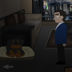
![]() SMKS's new title, Blue Karma, is a point-and-click game that's big on ambition. Descend, if you will, into the dystopian sci-fi world of New Vale City, a decaying urban center being fought over by rebellious gangs and fascist police. You play as one such agent, a dour-faced man named Riley, tasked with leaving his luxurious apartment to go nab an undesirable down in the slums on the bad part of town. In order to get there, you'll need to explore a truly impressive amount of detail in the game world, clicking to interact with just about everything in each scene, and absorbing an exhaustive amount of voice acting. Creator Shaun Michael K. Stone promises a novel based on the game's universe is expected in November of this year, so you know he's got some high hopes for this series. And frankly, he's off to a darn good start. Seriously, how often do you see a free online game put on such airs?
SMKS's new title, Blue Karma, is a point-and-click game that's big on ambition. Descend, if you will, into the dystopian sci-fi world of New Vale City, a decaying urban center being fought over by rebellious gangs and fascist police. You play as one such agent, a dour-faced man named Riley, tasked with leaving his luxurious apartment to go nab an undesirable down in the slums on the bad part of town. In order to get there, you'll need to explore a truly impressive amount of detail in the game world, clicking to interact with just about everything in each scene, and absorbing an exhaustive amount of voice acting. Creator Shaun Michael K. Stone promises a novel based on the game's universe is expected in November of this year, so you know he's got some high hopes for this series. And frankly, he's off to a darn good start. Seriously, how often do you see a free online game put on such airs?
 Like many point-and-click titles, Blue Karma is a mix of exploration, puzzle-solving, and trial-and-error. The puzzles and reflex challenges are a bit... back-loaded. They all sort of drop on you in the last few minutes of the game. Not a deal breaker, just a bit unfortunate, since there's so much creativity on display. It's for this reason, coupled with the fact that a fair amount of the options in the game feel a tad underdeveloped, that Blue Karma feels a bit like a demo at times. Which is fine. The game's undeniably fun and well-made, a solid introduction into this world we seriously hope we'll get to revisit soon. Point-and-click games are an oft-overlooked genre that are especially well-suited to the experimental realm of browser gaming, and if Blue Karma manages to inject a little vigor into the genre then we're all for it. Also, you can feed the dog. Don't be cruel. Play Blue Karma, and please feed the dog.


I quit after about 10 minutes.
The way you looked at things and picked things up was frustrating. Hold down the left mouse button, wait for a menu to come up, and then click a choice? No thanks.
Wow. Seemed pretty cool until it took5 minutes to go shower. And yes, the interface sucked.
Yeah, lump me in with the above. Too bad, I love a good dystopic atmosphere.
me too - even i was looking forward to the game, the long wait for the interaction to happen and all the in-between menus made me close the window unnerved after 5min.. pity, i'm sure the author's ideas were good, but the implementation sucks big time. i hope they remodel this one.
I thought the slowness was because of my computer. I was going to return later to try again; but now that I've read the comments, I think I'ma have to skip this one completely.
I made it past those first screens (it makes no sense to wait several seconds until you can interact with something). Great voice acting, the world has a nice vibe. However, I made it until one minigame, which I did not understand well, I lost it and thus I lost the game. I was unable to continue/restart the game from the failure point. I received some medals, but I was unable to see how many others were left and so on. A shame, really, because there is great potential in it.
It's actually a pretty short game once you make it to the end. I think they added the wait time just to prolong it.
Yep, made it to the minigame too. It wasn't too clear on how it worked. Didn't know which direction I needed to press, which resulted in failure. There was also a lack of feedback on what was happening adding to that failure. Would really be nice to be able to roll back to before the minigame to have another chance instead of it just ending. Making it instant failure is rather lousy, given the rest of the game is more straightforward.
I'm going to join others here in saying that this game has huge potential but needs a major user interface overhaul. The cycle-up and tri-part menu design "looks" cool but violates both fundamental engineering principals (form follows function, not the other way around) and good User Experience Design (UXD) including, at the very least, minimizing the number of clicks required to do something and eliminating needless delays to action.
I also saw underlying issues in the game logic:
1. Object states are not clean. For example: When the
toolbox in the alley
is unlocked and then you walk to another screen. When you come back it is now "locked" again even though it is physically open.
2. When listening to dialog there is no way to repeat a conversation. That would not be too bad except that if you do click in a talk balloon while it is playing you can miss several whole sentences since the logic allows some parts of the conversation to auto play and other parts not. A single click should move on ONLY to precisely the next sentence in the dialog script. This was very troubling when I was
talking with the two guys in the slums.
3. The move to another room/area/screen arrow is not always present. It should be. If a user is dumb enough to leave an area before checking everything that is on them, the game designer should not be limiting the player's option to do dumb things. When the designer does that it becomes less interactive game play and more being led on a leash.
One more thing, since the game has quasi-time (countdown) element the clock should be on-screen at all times. Again, too many clicks are required to get to basic and vital information.
During the intro, I thought "wow, great music". But that's the only thing I liked about this game, although arguably I didn't really give it a chance. I just couldn't face click-and-hold until a full circle formed, and then finding out that there was no point in looking at that. Kudos to those who soldiered on.
walkthrough?
Update