JayisGames.com is now available ad-free!
Jay is Games recommends Cheat Happens with 8,000+ games and 35,000+ trainers!

Train


  • Currently 3.4/5
  • 1
  • 2
  • 3
  • 4
  • 5
Rating: 3.4/5 (168 votes)
Comments (23) | Views (8,011)

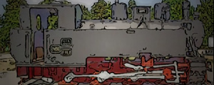
TrainIn a world of repression, you managed to stand out and survive the changes. It is not a safe place, but now you stand a chance to survive. Can you activate the machine in time and escape to another dimension?

Theme interpretation: "I have always dreamed to make a good game and this competition showed up as the perfect occasion for me. Also the involvement of Mateusz and his team has been an even bigger step forward in pushing my motivation in order to finish my entry in time.

In my game I interpreted the theme in a way that could be considered to be standing out of the classical interpretation since major part of the inspiration came from one of Mateusz' appreciated games, the "10 gnomes" series. It seemed very close to my field of game making possibilities, so I went out there and shot the scenes.

While building the game the way I considered the best this new idea to contribute into fitting inside the theme crossed my mind which was the plot, well inspired by the magic word "escape" which I embedded through the occurrence of inter-dimensional traveling, seemingly your only mean to escape from the world I've set the scene into.

And since then I've been always telling to myself "you can do it!" and here is the result! :D" -Teodor Stelian Ionescu.

Play Train

Walkthrough Guide


(Please allow page to fully load for spoiler tags to be functional.)

Train Walkthrough

GENERAL INFO/HOW TO PLAY:

  • The goal is to charge the "Interdimensional Pathline Capsule" by finding and clicking on at least 23 "pulsatory cores" around and inside the machine (train).

  • Navigate by clicking on any hotspot you can find; your cursor will change into a hand when you hover it over an active area.

  • Back out of an area by using the arrow at the bottom of the screen.

  • There are 29 total, but only 23 cores are needed. An icon in the upper left corner keeps count for you.

  • After you have found at least 23 cores, select "Activate" to end the game.

  • There is a time limit of 15 minutes. If you do not find at least 23 cores and select "Activate" before time's up, then you lose the game but can choose "return" to play again.

  • To begin the game, click on the screen to scroll through the narration or choose "skip" to miss the background story.

  • It's helpful to systematically work your way from the front of the train (right side of starting view) to the back (left side), then enter the engineer's compartment to finish.

This guide is designed to help you find all the pulsatory cores, but is not an exhaustive step-by-step walkthrough. The descriptions used may not be the official locamotive terminology because, well, we're casual game reviewers, not engineers! Have fun!

How to Get Inside the Engineer's Booth:

There is a red button you need to push.

It's near the front side of the train.

  • From the starting view, click on the lower right corner of the train's side (grey color area).

  • Then click on the white/red crankshaft area.

  • Then darkened area just above center.

  • Then middle of screen.

  • Then the curve in the bar on the right.

  • Push the big red button.

A picture of Spongebob pointing to where the button is found

LOCATIONS of the PULSATORY CORES:
Directly in Front of Train—

    Screenshot.

  1. Inside the light (circle) on top of chimney.

  2. Inside on the coupler (grey square), bottom middle of train front.

  3. Slightly to the left of the coupler, through the hole twice.

  4. From #3, click the upper right corner of the screen.

  5. Another hole, to the right and above the coupler (below left of the signpost).

Front Right Corner of Train—

    screenshot.
  1. Click the steps area to zoom in. Then the hole under the boiler. Then just left of center of the screen.

  2. Go up the steps area, then inside the bracket in the middle of the screen.

  3. Click on the piston housing (grey box on lower front corner), then on the center.

  4. Back up. Another one is just to the right of where #8 is.

Side of Train, Near Front—

    Screenshot.

    Screenshot.

    Screenshot.

  1. Zoom in on the front crankshafts then click on the area just above the crankshafts. Then click the center of the screen. Click upper right edge of screen, above valve case.

  2. Just below where #10 was found, below the curved edge of that valve case.

  3. Just below center, slightly to the left of where the rod comes down.

Middle of Train, Lower Part—

    Screenshot.

    Screenshot.

  1. From starting view, click twice on the crankshafts in lower middle of the train. Click inside the pipe on the right.

  2. Slightly to the left of #13, there's a yellow something; click on it.

  3. The middle of the screen, just above the crankshaft.

  4. Back up. Then, behind the wheel, in the gravel.

Middle of the Train, Upper Part—

    Screenshot.

    Screenshot.

  1. Click between the two chimneys on the top middle of the train. Then the area just below the Resita sign on the middle stack.

  2. Climb up higher by clicking between the left chimney stack. Then, click the area in background, right side of screen. Two more cores are found...

  3. In the valve wheel, lower middle of screen.

  4. Inside the forward chimney, top middle of screen).

Side of Train, Below the Engineer's Booth—

    Screenshot.

    Screenshot.

  1. Under the "RCA/RCE/RR" plaque to the right of the doorway.

  2. Below the step into the engineer's booth is a stone. Click behind the stone.

  3. The square area to the left of the step...click twice.

Rear End of Train—

    Screenshot.
  1. Click the left edge of the screen when facing the full side of the train to go behind it...Inside a pipe below the right window is another core.

Inside the Engineer's Booth—

    To get inside the engineer's booth, you need to find the red button and push it. A separate spoiler on how to find it is at the top of this walkthrough.

    Screenshot.

    Screenshot.

  1. Up in the top right corner of the engineer's booth, above control panel. Then, click by the camera (lower middle of screen) and then above the camera (middle of screen).

  2. Then, to the left of the control panel, in the corner.

  3. Screenshot.
    Click on center of the control panel to face it directly. There's four more..

  4. Under lever base, top right side of control panel.

  5. In oval locomotive plaque, left middle of control panel.

  6. Near switch on left edge of control panel.

  7. In coal chute, bottom of screen, below control panel.

Huge thanks to Ben who helped me with this walkthrough! Also mucho thanks to Jay for helping me re-edit this!

23 Comments

elerihamilton September 5, 2012 12:15 AM

Not grabbing me :/ The intro is really kinda long, the graphics are hard on my eyes (that could easily be just me, though) and it seems like a whole lot of random pixel hunting.

Reply

Judge Kerning's judgement of TRAIN:

Seeing that this game was developed in conjuncture with assistance from Pastel Game Studio, I thought I am in something marvelous. Turned out it's the exact opposite of greatness. Don't get me wrong, this was an interesting attempt by an eager participant with neat plot. The game just couldn't meet its own lofty expectations.

THEME (2 out of 5)
The story of time travel, cliche and done to death as it is, was put to good use as a mean of escape from oppressive society where one can truly achieve freedom. The focal setting of train is nicely imagined as one can freely explore the metallic conduit to reactivate it. Sadly, the intriguing concept was done in by boring and repetitive gameplay that neither innovates nor interests beyond its captivating and compelling intro.

IMMERSION + APPEAL (2 out of 5)
Right from the start, the introduction grappled me into the setting of oppressive society and its iron fist over the world.

I was hooked...
I was engaged...
I was ready to flee the world that seeks to end me because of my desire to be free...

Sadly, the game does nothing to back its thoroughly thoughtful introduction. See the train? Reactivate it by finding bunch of energy modules so you can escape to your freedom! Yay. The lack of variety and puzzles killed what remaining of my interests as I slog myself to finish the game by finding all energy modules before the time ends.

CONCEPT + INNOVATION (1 out of 5)
Nothing new was attempted here, aside from the interesting introduction. The gameplay is a straight rip-off of vastly interesting 10 Gnomes series, only that the use of innovation was attempted to be tied directly with the story to increase tension and drama. Such attempt was met with failure because the repetitive gameplay of search-and-find doesn't feel engaging nor does it fits well with the story.

PLOT + COMPOSITION (3 out of 5)
As I mentioned, big prop has to go to well written and thought-of introduction that managed to engaged me until the game started. The lack of in-game story and even a climatic conclusion are the biggest offenders to the plot that was established at the start. When people start to read the introduction at the start, they're expecting additional details within the game and at the end. Not seeing any of these would amount to our waste of time.

GAMEPLAY + TECHNICALITY (3 out of 5)
The game, once again, doesn't have engaging system of play. Search-and-find gameplay style definitely does not fits with the structure of your story. The typical escape game set within a warehouse would have been more interesting since it will allows you to construct in-game story to flesh out its setting and history. Or you could easily add some few notes and other puzzles to extend playtime and add variety.

Additionally... NO time limit and NO pixel hunt. I do not like to feel stress while I try to scourge through every possible nooks and crannies.

During my playtime, I found absolutely no bugs. Amazing! But one can easily use the TAB button to highlight hotspot, so one can definitely cheat as I found out myself. Perhaps Pastel Game can show you how.

OVERALL (2 out of 5)
Interesting game doomed by its unmet gameplay potentials.

Please don't be discouraged by this review. I am always brutally honest with reviews, so you can read what I think and learn from what I feel about the game. Practice, practice, and be objective about your own works! You have an amazing writing talent so put that to good use, either in video game, novel, movie, or other medium! I foresee a great future with your kind of talent...

Sincerely,
Judge Kerning

[Spoilers added to conserve comments space. Thank you! ~mod]

Reply

Train Walkthrough

GENERAL INFO/HOW TO PLAY:

  • The goal is to charge the "Interdimensional Pathline Capsule" by finding and clicking on at least 23 "pulsatory cores" around and inside the machine (train).

  • Navigate by clicking on any hotspot you can find; your cursor will change into a hand when you hover it over an active area.

  • Back out of an area by using the arrow at the bottom of the screen.

  • There are 29 total, but only 23 cores are needed. An icon in the upper left corner keeps count for you.

  • After you have found at least 23 cores, select "Activate" to end the game.

  • There is a time limit of 15 minutes. If you do not find at least 23 cores and select "Activate" before time's up, then you lose the game but can choose "return" to play again.

  • To begin the game, click on the screen to scroll through the narration or choose "skip" to miss the background story.

  • It's helpful to systematically work your way from the front of the train (right side of starting view) to the back (left side), then enter the engineer's compartment to finish.

This guide is designed to help you find all the pulsatory cores, but is not an exhaustive step-by-step walkthrough. The descriptions used may not be the official locamotive terminology because, well, we're casual game reviewers, not engineers! Have fun!

How to Get Inside the Engineer's Booth:

There is a red button you need to push.

It's near the front side of the train.

  • From the starting view, click on the lower right corner of the train's side (grey color area).

  • Then click on the white/red crankshaft area.

  • Then darkened area just above center.

  • Then middle of screen.

  • Then the curve in the bar on the right.

  • Push the big red button.

A picture of Spongebob pointing to where the button is found

LOCATIONS of the PULSATORY CORES:
Directly in Front of Train—

    Screenshot.

  1. Inside the light (circle) on top of chimney.

  2. Inside on the coupler (grey square), bottom middle of train front.

  3. Slightly to the left of the coupler, through the hole twice.

  4. From #3, click the upper right corner of the screen.

  5. Another hole, to the right and above the coupler (below left of the signpost).

Front Right Corner of Train—

    screenshot.
  1. Click the steps area to zoom in. Then the hole under the boiler. Then just left of center of the screen.

  2. Go up the steps area, then inside the bracket in the middle of the screen.

  3. Click on the piston housing (grey box on lower front corner), then on the center.

  4. Back up. Another one is just to the right of where #8 is.

Side of Train, Near Front—

    Screenshot.

    Screenshot.

    Screenshot.

  1. Zoom in on the front crankshafts then click on the area just above the crankshafts. Then click the center of the screen. Click upper right edge of screen, above valve case.

  2. Just below where #10 was found, below the curved edge of that valve case.

  3. Just below center, slightly to the left of where the rod comes down.

Middle of Train, Lower Part—

    Screenshot.

    Screenshot.

  1. From starting view, click twice on the crankshafts in lower middle of the train. Click inside the pipe on the right.

  2. Slightly to the left of #13, there's a yellow something; click on it.

  3. The middle of the screen, just above the crankshaft.

  4. Back up. Then, behind the wheel, in the gravel.

Middle of the Train, Upper Part—

    Screenshot.

    Screenshot.

  1. Click between the two chimneys on the top middle of the train. Then the area just below the Resita sign on the middle stack.

  2. Climb up higher by clicking between the left chimney stack. Then, click the area in background, right side of screen. Two more cores are found...

  3. In the valve wheel, lower middle of screen.

  4. Inside the forward chimney, top middle of screen).

Side of Train, Below the Engineer's Booth—

    Screenshot.

    Screenshot.

  1. Under the "RCA/RCE/RR" plaque to the right of the doorway.

  2. Below the step into the engineer's booth is a stone. Click behind the stone.

  3. The square area to the left of the step...click twice.

Rear End of Train—

    Screenshot.
  1. Click the left edge of the screen when facing the full side of the train to go behind it...Inside a pipe below the right window is another core.

Inside the Engineer's Booth—

    To get inside the engineer's booth, you need to find the red button and push it. A separate spoiler on how to find it is at the top of this walkthrough.

    Screenshot.

    Screenshot.

  1. Up in the top right corner of the engineer's booth, above control panel. Then, click by the camera (lower middle of screen) and then above the camera (middle of screen).

  2. Then, to the left of the control panel, in the corner.

  3. Screenshot.
    Click on center of the control panel to face it directly. There's four more..

  4. Under lever base, top right side of control panel.

  5. In oval locomotive plaque, left middle of control panel.

  6. Near switch on left edge of control panel.

  7. In coal chute, bottom of screen, below control panel.

Huge thanks to Ben who helped me with this walkthrough! Also mucho thanks to Jay for helping me re-edit this!

Reply

In response to Jay, thanks for the clarification. I was a bit confused by the Pastel Games logo on the title screen as I thought the studio have involvement with this game.

Chalk it up as a misleading advertisement.

Also, thanks for the suggestion with the spoiler tags. I will do that for the rest of my reviews.

Cheerio,
Judge Kerning

Reply

Just a small note—all participants in the competition are required to use the Armor Games logo and are also welcome to use the Pastel Games logo on their submissions. So they weren't necessarily trying to mislead you with that.

;-)

Reply

Clearly inspired by 10 Gnomes. Not a bad thing: not a great thing either.

Reply

Ohh I didn't notice the timer - that really sucked !

(Yes all the 10 gnomes references should have made me think, but it didn't)

Reply
nerdypants September 5, 2012 1:19 PM

Heh, I didn't notice the timer until after I'd wandered away from the computer to get a bowl of cereal.

As for the game itself, I really think it failed on many levels. The 10 Gnomes-style gameplay didn't fit with the escape theme, the plot was completely ignored after the intro, and the graphics were unappealing and at times disorienting. Adding a few simple puzzles would've improved the game quite a bit.

Still, the story was interesting. I think it just needed to be paired with a different type of game.

Reply

The opening was excellent. The graphics were well done. I liked the Gnome-feel with the timer, it seemed plausible with the story-line. I liked the idea of a button that allowed entrance into the train itself. I would have liked to see the other side of the train, since most likely, if I were in this situation, I would have checked there too. The ending was too abrupt and did not do as the opening led me to believe would happen. It needs some polishing, but overall a good concept.

Reply
hyperkinetic September 5, 2012 3:02 PM

The opening was long, and while it hinted at a much richer plot than was present in actual game play, it had nothing to do with anything you did. Time traveling trains aren't what I immediately associate with overthrowing a tyrannical regime single-handedly and it was clear the story was tacked on without the effort to incorporate it.

While 10 Gnomes, which this was obviously a rip of, used beautiful and intriguing photos that gave you a sense of exploration, discovery, and reward as you searched, in this every angle looks the same and the click zones seemed entirely arbitrary. A time limit only made the tedious search even more stressful. Not fun.

Reply

There are a variety of elements and intricacies that we as players are looking for in such games. The biggest issue that I feel you should note is the inclusion of a timer in the objective. I cannot state how ill-advised that decision is, considering that absolutely zero escape/hidden object games have managed to incorporate this idea and still maintain a pleasant, enjoyable playing environment. Secondly, the decision to pixelate/render your images in the way that you did subtracted from the immersion and feel of the atmosphere. It only serves to remind us that the environment is not real and just a game. 10 gnomes, one of the influences you've been influenced by, shows clear implementation of both of the above suggestions, and it would be advisable to think about why such decision were made and how they contributed to its appeal. Play a game, note what you enjoy about it, and incorporate those elements into your own. That is my piece of advice to you, good sir- to make good games, you must play excellent ones. Learn from your influences and it will only be a matter of time before you join their ranks! Good luck!

Reply

This game did not really captivate me like most escape games do. I actually don't really consider it an escape game because you need not escape but find these odd spots. It would be a good seek and find kinda game especially if that piece of paper was legible and maybe there was some form of twist. In the end it was like the gnome games that i don't particularly enjoy. The graphics were different and so was the story. i liked the added time limit i felt rushed and i felt the urgency.

Reply

I can understand someone being disappointed if expecting a standard escape game. Yet this is not meant to be a typical escape-the-room game; it's more a hidden object game. On that level, I enjoyed it very much.

My more detailed comments:

Like the JIG audience, I was also unsatisfied with the graphics and environment. Please give us gorgeous images that we want to stare at and explore in every angle!

I wanted much more cohesiveness in the story. I think the opening could be written a little tighter, perhaps as very short movie with less explication (instead of the slow click through of wordy narration).

And, I also wanted...no, expected, more story at the end...especially after the opening set-up. A different bit of imagery and resolution for losing, collecting the minimum, or finding all cores would be nice. Three endings—bad, good and perfect—are always a welcome feature.

Yet, for gameplay itself, there is indeed an audience who loves the seek-and-find type games. Don't be discouraged away from making this type of game again. You just need to make sure your opening sets up the player for what they're going to get so they don't come in expecting one thing and end up disappointed because they had another. Disappointed players who find themselves in content they don't want can be the harshest judges.

Lovely art, on the other hand, will attract those who don't care about gameplay as much as they enjoy looking at interesting images. Take a look at Memohuntress as an example. There were many players who hated the game, did not like the lag, did not like the game mechanics, did not enjoy the gameplay. But the players who appreciated the amazing design and conscientious attention to story development far far outweighed the naysayers.

When you win the players' hearts, you've won their vote!

You could improve on this one specifically by tightening up the story at the beginning and offering more reward for succeeding at the end. Then, next time, try using well-composed photography or hand-drawn artwork for your exploring/hidden object game.

Anyhow, I did very much enjoy your game! I look forward to your next endeavors.

P.S. Two more points:
First, I felt the time limit was also appropriate for the theme of this game given the need to evade capture (10 Gnomes games also have a timer with less thematic necessity).

Second, I'm glad that the author addressed the "escape theme" without going automatically to the obvious "make an escape-the-room game"—the two ideas are very different.

Reply

Sadly, after the intro, I do have to agree with the rest of the comments - throwing a timer into a game like 10 Gnomes does not bode well. The intro does offer a rich plot (though I feel that I had 'click' issues while trying to proceed through the story - for example, needing to click twice to change pages, and having to click in a new page to start the next part of the story), but it doesn't integrate well with the game. I enjoyed the visuals, but I do notice certain screens that are uncharacteristically brighter/color different than others - say, for example, the back of the engine.

Good luck!

Reply
samdulmage September 6, 2012 3:21 AM

As noted, this was clearly in the same genre of 10 gnomes, Garden Door and similar puzzles, none of which I really enjoyed all that much, pretty as they were. All of them seem to come down to "obsessively move your pointer over every single pixel until you can click on a scene and remember where you've clicked so that you can search for a complete collection of some group of things that you need for no particular reason", and I don't really find that fun. So I didn't last long with this one at all, but that's an issue I have with the genre, not this particular exponent of it.

Reply

I didn't really dislike this, and I think it has the makings of a good game, but it could use some work.

Review, spoilered for length:

I quite like the idea of the "Escape" theme being used as a motivation for the character and not as a literal escape the room. I thought the use of the timer was actually a nice touch for that. It was a little stressful, but hey, the protagonist had to be stressed too, and at least for me that helped with immersing myself into this character who's frantically searching the train.

The introduction was a little long and slow, though. Totalitarian governments definitely provide a motivation for escape, but most people have seen quite a lot of them. This particular one didn't do anything to set itself apart from the trope. Repression? Seen it. Torture? Seen it. You did a lot of telling and not a lot of showing. Just saying the word for something horrible doesn't usually call up the feeling of "oh god, I need to get away." Think about what kind of world your story takes place in, what specifics the horrors would take, and how the character you're writing would feel about them. Is he somebody who's barely kept a step ahead of the authorities and can't stop thinking about what they would do to him? Is he somebody who's been doing this for so long that he's just weary of even worrying? Does he feel cornered, or tired, or simply even done with all of this? Is he really the last person around who opposes his government, or is it just that for all he knows, he could be? Has he never been caught, and as far as he knows, the worst possible thing he could imagine will happen to him if he is? Has he been caught before and knows exactly what would happen?

And if you're using horrible things as a plot device, and you're using the fear of those horrible things to motivate the main character, it's generally a good rule to make the player squirm, too. You don't need to be gory or explicit- vagueness can really work, because people have a tendency to fill in the blanks with what's personally unsettling to them. Just give us a little more to extrapolate on, okay?

The text also comes up a little bit slowly, which makes the reading feel slower, and there's nothing to do but read. Maybe add some more interactivity to your introduction? This isn't a visual novel, it's a point and click game- and I'm saying that as a VN fan and dev! But this is obviously geared at a different audience, who aren't signing up for a reading-things-and-clicking-to-read-more-things experience. Interactivity and things to point and click and puzzle out are pretty necessary in this genre. Interesting visuals are good, too. Remember, your introduction (and your start screen!) is your first impression on the player, and you want to make a good one.

(And on that note, a small nitpick about the start screen. Bleeding Cowboys is a very pretty font, but it's also very recognizable as Bleeding Cowboys, and using a well-known font like that can make your game come off as unoriginal.)

On to the main portion of the game! I get the sense that (and please correct me if I'm wrong!) you had an abandoned train in your area and you wanted to take pictures of it and use that for the visuals of your game. There's nothing wrong with this, but the way you connected the train exploration to the main story didn't quite work for me. The protagonist knows that there's something up with the train, and... then suddenly time travel? It would have made more sense to me if he already knew that the train was hiding some time-travel project, or even that it might be hiding some time-travel project. If it's just probably hiding something, then why is he there, instead of making a run for it? I think it would also be more believable if he'd been researching the train previously- maybe there could have been a previous level, where he was just looking around the train? Having a narration sequence, a train sequence, another narration sequence, etc, could have cut down on the narration the player has to read at one time, and also made the game feel more tied together, since the narration and train wouldn't be completely independent of each other. Building the threat gradually might have made it feel more real, too. Or who knows, maybe this isn't the right story for this game. It's your plot and you obviously had a lot of love for this train. Find a way to make the train feel connected, or find a different plot that you can connect to the train in a more cohesive way.

I agree with some of the other commenters that the filtered photographs felt a little lacking. Filtered photographs can be a good place to start, but they can also feel a bit flat and lazy, and sometimes, it's hard to tell what's even going on. Drawing on top of them can make them look better and also draw the player's attention to the places that can be clicked, which is another problem I had here- sometimes I had to use the tab feature to figure out which places could be investigated, and which couldn't. If you don't feel like drawing on the photographs is something you could do well, I suggest working with an artist. There are plenty of people out there who are talented, but new to game art and looking to develop their skills.

I did enjoy the exploration, though I felt that:

1) There could have been more to do than just collecting things. Finding the button made the game more fun, but there was only that one extra piece of gameplay. I would have really enjoyed unlocking the train for exploration piece-by-piece, or just having more ways to interact with the train besides hunting and clicking. Hunting and clicking can be frustrating and monotonous (especially with the filtered photographs) so having a few more things to do could break that up and make it more exciting for the player.

2) The red things were a little... strange and unexplained? How do they affect anything? What is the protagonist doing when he "activates" the train? If he doesn't know what's going on with the train, then how does he know how to activate it? I like mystery, I like protagonists not always knowing what's going on, but this felt like it was too much. Maybe show something happening to the train as the player collects the red things, and some way to activate it that the player can see?

3) The endings didn't feel very satisfying. You just... hear that the protagonist escaped, without much explanation or tie-in to the story. What does he feel? If you're asking us to care about this character, give us some closure for his story. A positive ending for a game is supposed to be kind of like a reward for the player- maybe a cute image, maybe a nice little bit of story, maybe something fun to do at the end. There wasn't much in the way of closure.

Please don't be discouraged from making games. This definitely had promise, you just need to work on your execution a little. I realize you had a time limit, and that's always hard, but maybe next time you should try making a game without a deadline, just to make sure everything's lined up and polished and the best it can be.

Reply
elle September 7, 2012 12:31 AM replied to Alice

Even I feel inspired by that feedback to make an improved, way awesome game, and I'm just a poor sap who's too unskilled to make games so I review them instead. I agree with all your comments. Very helpful and fair criticisms.

But I think I can answer your question brought up in point #2... there is a note visible from the starting view that explains what those "red things" are (it's just hard to read in the default screen size). They're "pulsatory cores" for the "energy centers" and you need to stabilize them.

Reply

Many thanks to everyone for their awesome reviews and suggestions and I admire your patience to play my game and in the end express your thoughts and conclusions.

And now, as for bringing some answers:

I do understand that the major disappointment was the contrast between the intro story and the actual gameplay itself. I used to consider the story more as an addition to the game which's goal has been to make it stand out from the overall view of a standard rip off, a bonus, a reward which unfortunately was no where to be found in the end, where the content must offer the most concentrated satisfaction and even I felt it's need at that point.

I also wanted to make an outro, where supposedly the energy centers would unite and activate the device which would transfer you to another dimension where your journey is presumed to continue.
(and yeah, I am planning to somehow take care of this continuation in the future)

The problem with this was obviously time. I could've done it but the clock was ticking and with the deadline coming about, I had to finish it all and submit it in time.

I also have to admit that it is my fault for chosing an elaborate story for the intro, instead of something more simple(maybe more vague), more fitting with the game itself and kind of gameplay.

As for the note, yes, it is supposed to make a connection between the intro and the game and is placed on the bottom-right of the first screen, though "it's just hard to read in the default screen size". I widened the screen resolution today and also the note to make it readable. I hope this gets solved soon.

Most of you encouraged me with your kind words to continue what I have started.
After all, this first step was not in vain. You have all have my promise there that I will continue and "make an improved, way awesome game" giving that next time there will be no deadline to interfere with my work. ;)

Reply

@ elle, ITS:

I actually didn't see the note, sorry for that! I played this game like three times, to try to get a good feel for it and give a fair review, so I'm not entirely sure how that happened.

Looking at the note now. If it hasn't already been changed, I think making it slightly bigger is a good idea. It's readable, but it's a little difficult.

I do still think that showing something on the train change as the player collects the pulsatory cores would have been a nice touch, though, and that possibly the note could have been introduced differently- I don't really believe that after so long, a piece of paper would still be there in readable condition, but I would have believed the protagonist maybe finding it while doing research on the train, or something. But thank you for letting me know the note exists, and you're right that it does make the "red things" make more sense.

@ ITS:

I am really impressed with you right now. It sucks to work hard on something and have the reception be mostly critical, and a lot of people react really badly in those situations. But not you. You're being really great about the feedback and constructive criticism you're getting, and that's a quality you don't see very often. I hope I helped in some way, and I'm definitely looking forward to seeing what you come up with next!

Reply

Didnt get to the end and not inspired enough to try again

nice work

its my second game played and not the leader for me so far.

I kept looking for gnomes 8-(

Reply

omg... I hate this type of game. However, I persevered. This is actually the first "hunt for x" game I have completed. It took me two goes such is my determination to play all these games. I enjoyed the intro, and the art was nice. I think what made it was the lack of "Ha, there's nothing here" which is what I hate so much about the gnomes. At least there was something in (nearly) all the places I checked.

I'd be interested in following the story line through other levels. This is a series I could get into. I hope you make it into one.

Reply

Whew, I was glad that the TAB key worked. Without the TAB key, I wouldn't have stayed with the game for as long as I did. But I finally got bored when I felt I had visited every possible location, and still had only found 20 spots. I'd kind of like to see the ending commentary, but not enough to grind through everything again to find the last 3 spots.

(I never understand why some game developers want to disable the TAB key - as though they are protecting us from something.)

Reply

^ Scroll Up | Homepage >

Leave a comment [top of page]

Please consider creating a Casual Gameplay account if you're a regular visitor here, as it will allow us to create an even better experience for you. Sign-up here!
  • PLEASE UNDERSTAND SITE POLICIES BEFORE POSTING COMMENTS
  • You may use limited HTML tags for style:
    (a href, b, br/, strong, em, ul, ol, li, code, spoiler)
    HTML tags begin with a less-than sign: < and end with a greater-than sign: >. Always. No exceptions.
  • To post spoilers, please use spoiler tags: <spoiler> example </spoiler>
    If you need help understanding spoiler tags, read the spoiler help.
  • Please Preview your comment before posting, especially when using spoilers!
  • No link dropping, no domains as names; do not spam, and do not advertise! (rel="nofollow" in use)
chrpa Jayisgames needs your help to continue providing quality content. Click for details Welcome to the Roundup 66 - Retro with four games! After you find the ten monkeys in the chapter, look in the inventory. You will find a...  ...
chrpa Jayisgames needs your help to continue providing quality content. Click for details Welcome to the Roundup 65 with three games! As mentioned in the previous roundups, only odd-numbered episodes are featured since even-numbered are for Robin Vencel's patrons (the...  ...
chrpa Jayisgames needs your help to continue providing quality content. Click for details Hi! Weekday Escape and Weekday Puzzle are here! First we have two new cans from tomoLaSiDo and then two small rooms from isotronic. That's all for this...  ...
6,365 Views
0 Comments
chrpa Jayisgames needs your help to continue providing quality content. Click for details Welcome to Mobile Monday! We have another beautiful game from Nicolet and it's a winter game as it should be. Tasuku Yahiro have released another of their...  ...

HELP Jayisgames.com

Recent Comments


Display 5 more comments
Limit to the last 5 comments

Game of the week


Dark Romance: Vampire Origins Collector's Edition

Your Favorite Games edit

add
Save links to your favorite games here. Use the Favorites editor.

Monthly Archives