I Made This, You Play This,
We Are Enemies
![]()
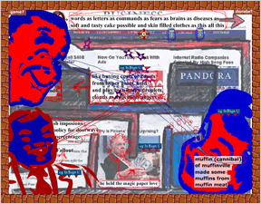
 From Jason Nelson, the deranged creator of Game Game Game and Again Game, and Alarmingly These Are Not Lovesick Zombies, comes I Made This, You Play This, We Are Enemies, a platformer wearing the Web's skin and laced with hidden passages. Those who have no stomach for cognitive dissonance will want to move on, but fans of Nelson's previous work will find a funny onion to bounce around in.
Controls are what you would expect to find in a platformer, use the [arrow] keys to move, press [space] to jump. Each level is a single room, with the goal to reach an invisible door in the opposite wall, usually with arrows guiding the journey. Your conventional exploration will be stymied by crazy things that make you purchase a farm and restart the room, not to mention visual and auditory noise that keeps you on your toes. The game has some hidden levels, so you will have to explore to find the true ending.
Analysis: "We Are Enemies" plays off the notion that game designers and players are at odds, and that games are about hardcore challenge. He short-circuits conventional challenge by allowing you infinite respawns, and then launches into a gleeful exploration of Web noise culture, with all the poignancy of a William Burroughs cut-up (which means as much as you want to make of it). The gameplay is simple but that's alright, this is an aesthetic adventure and not as mind-blowing as the first time around, but worth drumming up a few wry smiles. My favorite part was T. Boone Pickens holding a wad of bills.
Get down with your Enemy.


I almost forgot what it was like to play a game made by someone who hates his audience so much. Not since Surprisingly These Are Not Lovesick Zombies anyways.
Still surprisingly a pleasant experience, you know, once the siezures stop.
crazy! fun! art!
William Burroughs cutup. Will anyone understand this without looking it up? I do. Now let's play "William Tell"!
I thought this was a really interesting experience. I honestly feel as overwelmed (as one does when playing this game) when visiting certain poorly designed, ad-ridden websites.
I really enjoyed the odd videos you could click to bring up, such as the "medicine horse" one. The odd sentences were pretty interesting too. eg. "Always remember to set fires"
It makes me feel like I'm crazy.
It's like LSD, only more interactive.
I stopped playing during the level after the "breather" level; with everything obscuring the screen, I couldn't progress without hitting the obstacles I couldn't see. That's when the game's concept went from confusing to obtrusive.
Did he mean at the beginning that he was trying to avoid having a meaning to this?
Has there been a trend where game designers have treated the players as their enemies, or at just make fun of them? It's a concept that sounds like it would alienate or insult the people who look to enjoy games rather than just "beat" them. Think of sitting down to a paper-and-dice roleplay game, only to have the DM or Narrator or whomever recite the above title to the players: that game won't last long.
"William Burroughs cutup. Will anyone understand this without looking it up?"
Cool thing about the net, it's easy to look stuff up.
That was pretty fun, and an interesting commentary on both platform game design and consumer culture.
And yes, I know who William Burroughs is. I even went to a party with him once. It was like drinking beer with an alligator.
Awesome concept, but I quit after the farm-purchasing level. I think I purchased over nine thousand farms that time.
I believe what it's trying to tell you is that you died:
"bought the farm"
Ugh...
Ridiculously difficult, a cluttered mess, and just plain idiotic.
That's what Web Art is all about.
This game is an obvious satire on gaming culture. Being a semi-hardcore gamer myself, I had a smile on my face. It was more cluttered than G,G,AAG, and truly portrayed the internet in a different perspective. Look carefully, and you will se some crazy stuff.
Fun Factor: -33284937/5
Update