
UX in Micro-Transactions and Fast Payments for 2026: Balance Between Invisibility and Control
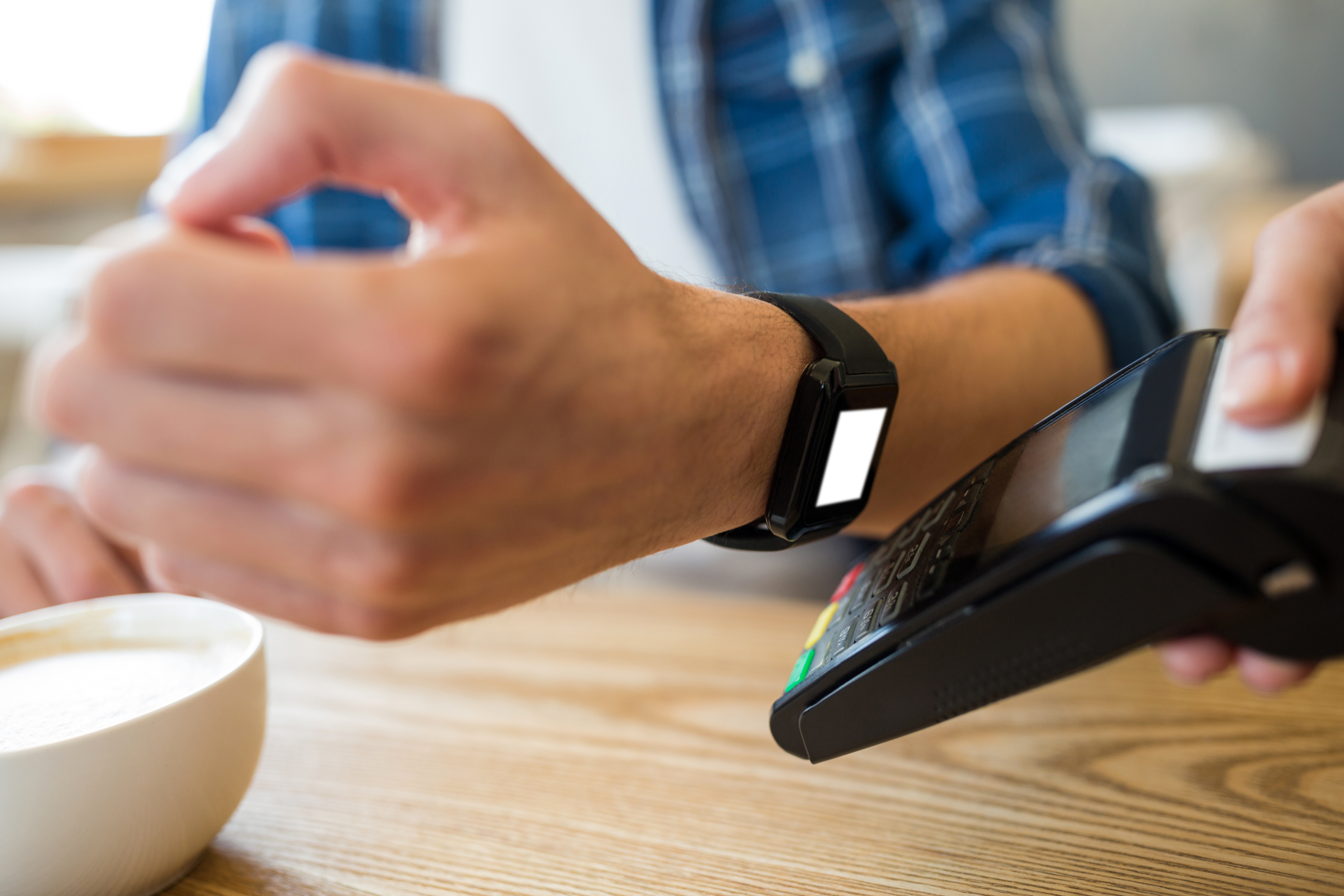
Instant payment systems like FedNow, SEPA Instant, and UPI are becoming expected features in many markets. Nobody wants to sit around waiting for a payment to clear anymore. Instant checkouts are just the baseline now. Companies dumped millions into cutting out every extra click, form field, and loading screen they could find, all to get users from "I want this" to "paid" before they even have time to reconsider.
That trend eventually hit a wall. If you make a checkout too fast, people start getting nervous. You click once, see money leave your account, and immediately wonder if you tapped the wrong thing or got hit with some extra charge you didn't notice. Small transactions are especially bad for this because they happen so fast they almost feel like a glitch.
Take someone trying to grab a promo deal, like getting 150 free spins for $1. They are willing to click the sign-up button, but if there's no clear display of what they've bought, it doesn't feel legit. People who don't see zero-friction payments as convenient may start wondering what just happened.
The real UX challenge today isn't making transactions faster; it's placing small, intentional speed bumps so users know exactly what is happening with their money.
Biometric Authentication and Invisible Payments
Passkeys and biometric authentication are reducing reliance on passwords and SMS-based verification in many payment flows. The technical side of processing a payment happens in the background, which cuts down waiting times, but it opens up new design problems on the front end.
When a purchase requires zero manual input, people end up buying things unintentionally. A misplaced tap while scrolling through an app can trigger an instant charge before anyone realizes what happened. To fix this without bringing back slow SMS confirmation codes, product teams started using gesture-based confirmations. A hold-to-pay button that requires keeping a thumb on the screen for one full second works better than a simple click. It gives people enough time to stop an unwanted purchase while keeping the interaction nearly instant.
AI Agents Handling Everyday Purchases
AI assistants do more than just help with your calendar and quick replies. They can make small payments in the background, like extending a parking meter, renewing a subscription, or adding more API credits when needed.
The user experience here isn't about designing better checkout buttons because humans aren't clicking them anymore. Instead, the interface shifts toward permission settings and dashboards. People need simple controls where they set strict caps on what an AI can spend without asking first. If an agent stays under a five-dollar limit, it executes the payment quietly. If it goes over that line, it sends a plain push notification asking for a quick biometric approval.
Transparent Pricing Models for Small Amounts
Micro-payments are everywhere now, especially in media access and AI tools where users pay per article, per image, or per minute. The main issue with small charges is clutter. Nobody wants twenty tiny bank notifications for ten-cent purchases scattered throughout the day.
Good interface design addresses this by showing real-time price counters before an action takes place. If generating a summary costs two cents, that exact cost appears next to the action button. To prevent notification spam, apps gather those tiny charges into a single batch tab that clears once a week or when the total hits a round number like ten dollars. People see their running balance in real time, but their bank accounts only get hit once.
Building Trust Through Smarter Interfaces
Security steps often feel annoying, but a complete absence of feedback makes people nervous. When an interface hides processing steps entirely, users wonder if the site is broken or if they got charged twice.
Designers handle this by showing quick post-transaction summaries right on the screen. Instead of throwing up a generic green checkmark that says "Success", the app displays a short banner showing the exact amount paid, the updated account balance, and a three-second window to hit a short window to cancel the action or request a refund. That brief grace period lets people reverse accidental taps immediately, which removes the stress of dealing with customer support over small charges.
Checklist for Product Designers
Setting up micro-payments requires balancing speed against clarity. A practical checklist for checking payment flows looks like this:
-Do passkeys and biometrics actually stop people from having to type card numbers or wait for SMS codes?
-Is there a hold-to-pay button so users don't trigger accidental purchases while scrolling?
-Are all fees shown up front before you pay, or do extra charges still pop up at the last second?
-Can users review and adjust spending limits for automated AI purchases in under three clicks?
-Does the interface give instant confirmation showing the exact charge and remaining balance right after a transaction completes?
Conclusion
Designing micro-payments in 2026 isn't about making checkout instant anymore - it's about making sure users feel in control. Striking that middle ground between seamless speed and clear confirmation is what turns a quick transaction into a trustworthy product experience.



Update