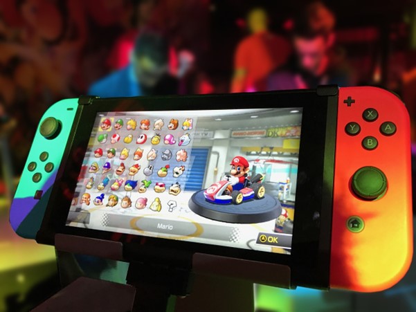
Color is a powerful tool in game design that can influence emotions, guide the player, establish branding, and contribute to overall aesthetics. Thoughtful use of colour enhances gameplay and creates a more immersive experience. Here we will explore some of the key ways that color choices impact video game design.
Establishing Mood and Emotion
Colours have psychological associations that evoke certain moods and emotions in people. Warm colours like red, orange, and yellow energise and excite, while cool colours like blue, green, and purple are more calming and relaxing. Using colour strategically in games helps set the overall tone and emotional impact. For example, an autumnal orange and red colour palette with a brown colour code would match the cosy, comforting mood of a farming sim game. A futuristic shooter set in icy terrains would rely on stark greys, whites, and blues to convey its bleak setting. Selecting colours that align with the desired tone and ambience of the game world is an important design choice. Using the wrong colours, such as greens and oranges in a space-themed game would jar the player and make it hard to fully immerse in the game, which is a massive mood killer for a gamer.
Guiding the Player
Colours can also visually guide the player by highlighting interactive elements or suggesting paths through the game environment. Vibrant colours draw the player's attention to important objects like power-ups or enemies. Arrows in a contrasting shade can point along the right route. Hazards and dangerous terrain often use menacing reds and blacks as a warning.
Subtle environmental cues use colour to show players where to go without distracting on-screen indicators. A golden glow might lead towards a quest objective, while a dull grey path indicates that an area has already been explored. Thoughtful use of colour gives visual cues that help direct gameplay in intuitive ways.
Establishing Brand Identity
A game's distinctive colour palette is a key part of its visual identity and brand. Iconic franchises become associated with signature colour schemes that fans recognize instantly. Nintendo's bright red is synonymous with Mario, while Xbox uses shades of green to maintain brand consistency across its platforms and products.
When designing new IP, unique colour choices help the game stand out in the marketplace and start building brand associations in players' minds. A cohesive palette across marketing and merchandise also strengthens brand identity. Colour is a vital part of establishing the look and feel customers identify with a game.
Contributing to Aesthetics
On top of practical applications, colour use also plays an important role in the aesthetic style and visual appeal of a game. The striking neon pinks and purples of Cyberpunk 2077's futuristic cityscapes are intrinsic to its 1980's retro-futurist vision. The muted earthy tones in Red Dead Redemption beautifully capture the look and feel of its Wild West setting.
Colour decisions give games their own distinct visual flavour that delights players. Using harmonious combinations of colours that complement each other creates appealing scenes and environments. More exaggerated and clashing palettes make bold artistic statements that stand out. The aesthetics of a game depend heavily on the artistic use of colour.
Reflecting Gameplay Mechanics
In some games, shifting colour schemes play an active role during gameplay. The surreal puzzle game Monument Valley uses colours to indicate areas of the environment that can be interacted with. As players progress, the colours and geometry of the world transform, opening new paths.
The roguelike shooter Risk of Rain 2 features colour-coded difficulty zones that progressively become more dangerous and deadly. This ties the colour palette directly into core gameplay, giving visual cues about the rising challenge. When colour schemes react to players' actions, they become more than just decoration.
Accessibility Considerations
Colours should be selected carefully to ensure accessibility for players with various vision needs. Using strong colour contrasts and avoiding relying only on subtle hue differences makes games more playable for the colourblind. Options for recolouring interfaces or switching to high-contrast modes allow for greater accessibility.
Bright colours can cause issues for players with photosensitivity, so offering ways to reduce intensity is also important. Considering how colour choices impact different vision abilities results in more inclusive game worlds.
Colour is a versatile tool that game creators can harness to enhance and accentuate many aspects of the player's experience. Mood, navigation, branding, aesthetics and gameplay mechanics all benefit from thoughtful use of colour. A well-executed colour palette makes games more immersive, memorable and accessible for all types of players.


Update